Brand Build
Advanced. Intelligent. Violent.
Client
Line of Fire
Date
2021
Services
Design | Photography | Messaging | More...

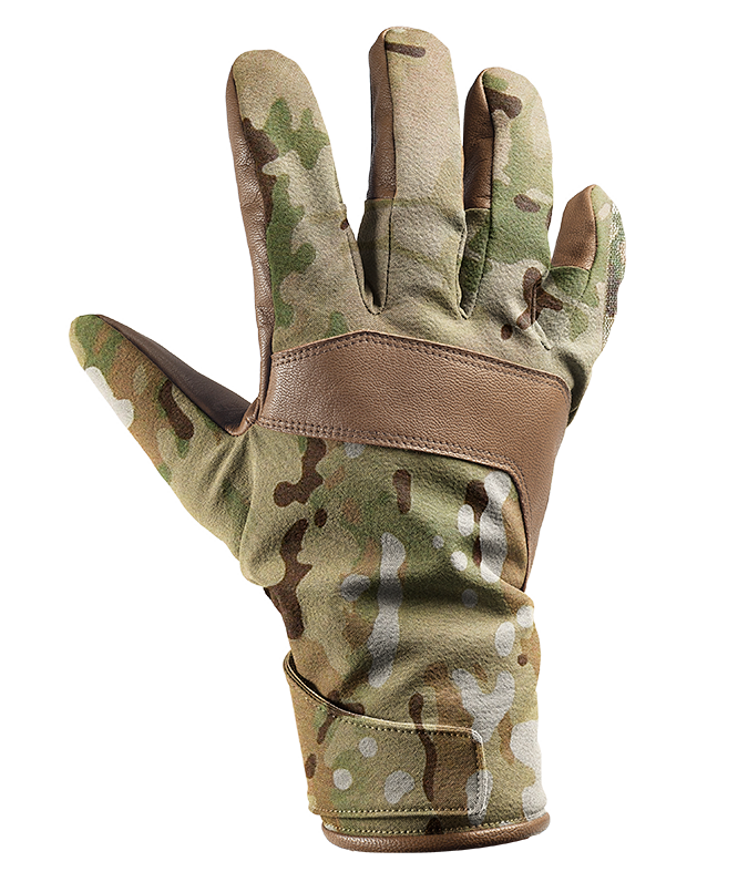
This is not your ordinary brand. Serving those who lay it all on the line, Line of Fire must do the same. Manufacturing tactical work gear and accessories for military and law enforcement, Line of Fire makes the best for the best.
The Objectives.
Line of Fire was born in government contracting, manufacturing their gear to meet strict local, state, and federal government requests. As business grew, a consumer brand needed to be built in order to reach more customers and expand their reach. Their products occupy the high-end space of the pricing spectrum. The branding must communicate quality and innovation, while remaining true to the brand's origins.
The Plan.
As always, we had to begin with some investigation into the market. Talking with countless special operators, Marines, big Army buyers, and government contractors we gained a good understanding of the rules and how to break them. We got to work writing brand messaging that was direct while developing a tone of confidence. The execution of aggressive photography, a futuristic color palette, and a full deck of visual assets began.

Strict guidelines for the existing
logo and wordmark to ensure
recognition and consistency.

Modern Minimalism.
Designing for an industry fraught with secrecy and pragmatism was a unique challenge. How can we help this brand stand out, while targeting an audience that prefers to blend in? Modern Minimalism. To us that meant a restrained usage of modern colors and a commitment to confident minimalism in the application of typography, supporting graphics, and imagery.


A clandestine merger of photography
and minimalistic graphics.


Color Takes Shape.
The primary objective was to avoid
over-designing. Silence can be loud; less can be more. We wanted to combine the selected hues with refined supporting graphics to highlight Line of Fire's products and brand personality.